- Ideas
- Events / Programming
-
 Ideas
Ideas

Show FULL status on Member portal for events with multiple dates.
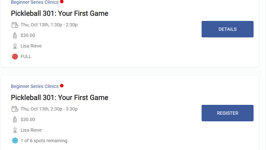
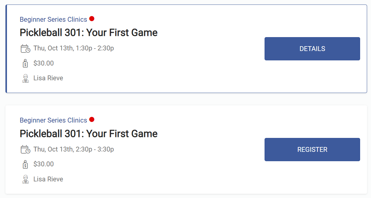
On the member portal, currently, if a specific date of an event with multiple dates (like weekly open play/drop ins) is full, the REGISTER button is replaced with a DETAILS button. The Widget does this. Please set up the member portal to do the same and show FULL. It's confusing and inefficient for our members to not have the full status visible.
Below: 1st image is from our website where we use the widget. Perfect! Second image is from the member portal...no full status visible. It would be helpful to have this consistent and have the full status visible.
I believe this may be tied to making spots available visible. Unfortunately, it seems this option is only available on a global level such that if we select to have spots available visible it applied to ALL of our events. This needs to be an option at the event level so that we can choose which events to have spot available visible. The widget seems too bypass all this.
Website Widget:
Member portal:
Customer support service by UserEcho

Beverly,
I tagged this as a bug to be looked at on Monday.
It should be fixed soon!
Thanks,
Tim
I suggest an overall consistency in the way that event status is visible. If the event is full, it should say FULL, across the board. This is another example where it should say FULL but says DETAILS instead. Ideally, a member should be able to easily look at a calendar of events and see if an event is full without having to be clicking around. We really do get inundated with calls because of this.
Below image is an events calendar widget embedded on our website. As an example, the Open Plays on the weekend were FULL but it just says Details. Same with the Agenda view.
Also on the mobile app. Event List, it doesn't show FULL. So basically, potential registrants have to click on each event individually to see if it's full or not. Please make the lists show full status so that people can just scroll to find available events. If you need an example, go to my mobile app (member's side) and try to sign up for a Pickleball 101 clinic.
This really needs to get fixed.
If the reason why this says DETAILS is because the event is full and there is a waitlist, can the button please at least say WAITLIST. Note: the widget shows the DETAILS button also (see previous images), but at least the FULL status is available under the instructors name. If there is any confusion about this please get in contact with me directly.
One more: this is what it looks like on the member portal on the Court Reservations calendar: Everything says DETAILS (even when there are spots available to register AND when it's full, although this view seems to show WAITLIST along with details if the event is full and IF there is a waitlist). So everything says DETAILS here. Please work on getting all schedules, lists and calendars to use the same language and to communicate "at a glance". Some people do not even understand the difference between and court reservation and an even registration. They need a lot of hand holding and if we could just get this as clear and consistent as possible that would be fantastic.
Beverly,
We will be making the changes on the calendar consistent as well based on your suggestions!
Thanks,
Tim