Your comments
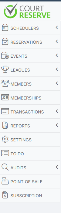
Bumping! Would love to see this! Maybe it can be added to the left side menu?
This, still needed!
Maybe it can be a section added to the left side menu?
Keep it real simple, one text field with font and bullet point options.
Maybe call it Daily Notes or Club Updates or something like that.
CourtReserve comes out will fantastic updates which sometimes result in a change to the way our club completes a process. Or there may be something particular to note for that day/week (e.g., an inventory delivery) or just a heads up. Anything really. CourtReserve is not just a court management system but a CLUB management system. It would be so fantastic to have this type of notes section so that sub-admin/staff can have one central place to look for notes.
Please please add this!
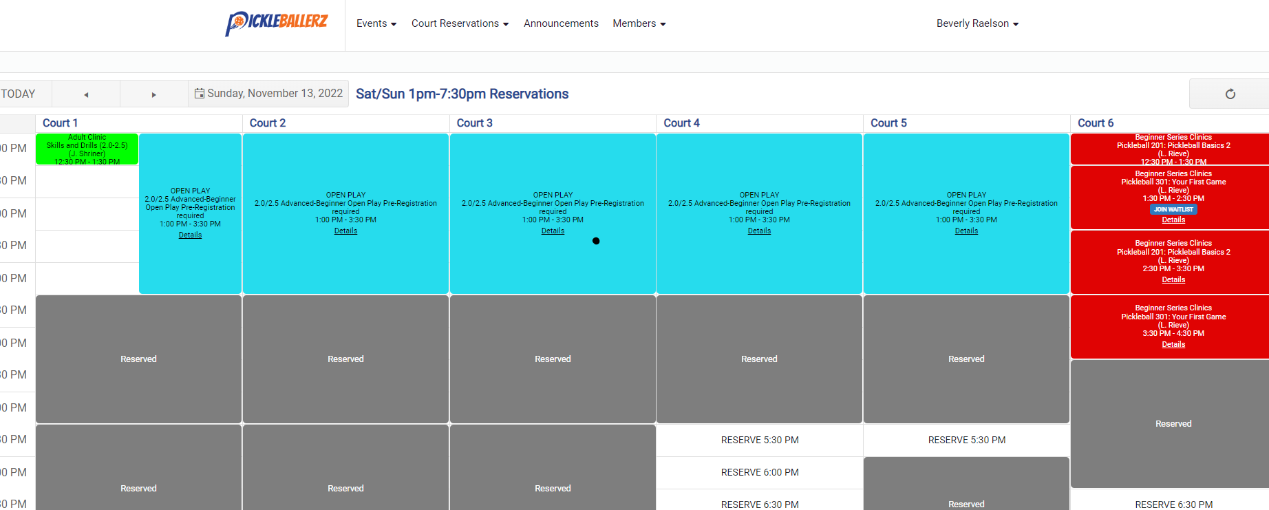
For each membership the event fee should be listed. Since it's just a box that opens when the mouse hovers over the info icon there is plenty of space to add it in and will not interfere with the main functions of the expanded scheduler. I realize this idea only works with the expanded scheduler, however, that is where we work from the most. I'm not sure how this would work from the Event Calendar view as there info icon is not available. Maybe the same icon can be available on the calendar as well?
While you're at it, "disable drag and drop" should be the default setting. Enabled it's the easiest way for an admin unknowingly to create mass chaos! Not to be dramatic ;)
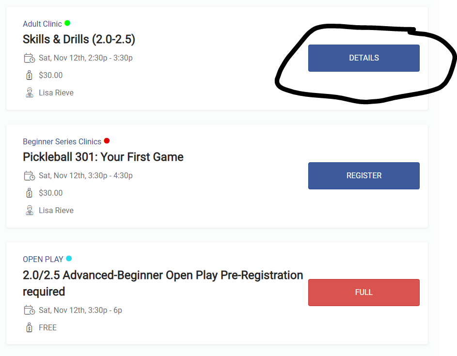
One more: this is what it looks like on the member portal on the Court Reservations calendar: Everything says DETAILS (even when there are spots available to register AND when it's full, although this view seems to show WAITLIST along with details if the event is full and IF there is a waitlist). So everything says DETAILS here. Please work on getting all schedules, lists and calendars to use the same language and to communicate "at a glance". Some people do not even understand the difference between and court reservation and an even registration. They need a lot of hand holding and if we could just get this as clear and consistent as possible that would be fantastic.
If the reason why this says DETAILS is because the event is full and there is a waitlist, can the button please at least say WAITLIST. Note: the widget shows the DETAILS button also (see previous images), but at least the FULL status is available under the instructors name. If there is any confusion about this please get in contact with me directly.
Also on the mobile app. Event List, it doesn't show FULL. So basically, potential registrants have to click on each event individually to see if it's full or not. Please make the lists show full status so that people can just scroll to find available events. If you need an example, go to my mobile app (member's side) and try to sign up for a Pickleball 101 clinic.
This really needs to get fixed.
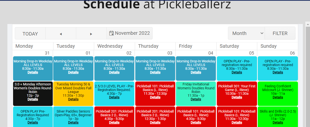
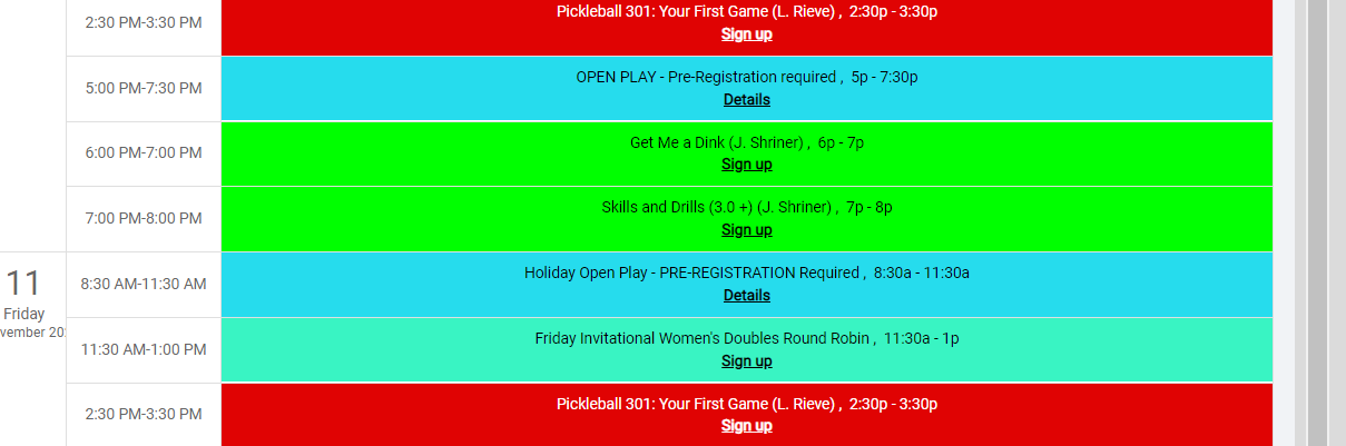
I suggest an overall consistency in the way that event status is visible. If the event is full, it should say FULL, across the board. This is another example where it should say FULL but says DETAILS instead. Ideally, a member should be able to easily look at a calendar of events and see if an event is full without having to be clicking around. We really do get inundated with calls because of this.
Below image is an events calendar widget embedded on our website. As an example, the Open Plays on the weekend were FULL but it just says Details. Same with the Agenda view.
Customer support service by UserEcho


Bumping! I think this would be a very valued feature that most clubs would use and appreciate.